Jonathan is a
UX/UI Designer
who is interested in creating accessible and visually appealing products for you!
WORKING WITH YOU
Case Study
UX/UI DESIGN

Transique Bus App Case Study
-
This project entailed creating a better Bus App for users in the Midwest, who specifically were having issues catching their bus stop at Washington & Street. Goal of this project was to create an easy-to-use App that allowed users to easily catch their bus. To help me in this project, I used survey information from locals in Washington, DC, 3rd highest bus transit cities in America to better help users in the Midwest! I used a soothing color palette to help users feel comfortable using this App because in the past users have had problems catching their specificbus/route, as well as suggesting a live Bus Tracker and Time Tracker for users to use so they can get to their specific stop to help users manage their time better!
-
In 2022 I led the redesign of the Bus App for Transique, a Bus Service in the Midwest on an App. My responsibilities included user research, concept ideation, aligning key stakeholders on product goals, designing user flows, visual design, prototyping, user testing, incorporating user feedback into design iterations, branding, ideation, and quality assurance. Delivered a Hi-Fi Prototype. Tools used for this project: Google Forms, Google Docs, Google Surveys, Notion, Google Slides, WebAim, Google Color Picker, and Figma
Scope & Constraints
-
Constraints of this App before I started working on it, were: users were inaccurately making it to their correct bus stops in a timely manner and catching wrong buses. I made an easy-to-use Hi-Fi Prototype included with calming and soothing colors for users who previously were stressed because they were catching the wrong bus or route.
Process
Designed this App for users already having problems catching their stops. Main goal was to implement a soothing & calming color scheme for users already having problems catching their stops.
Preformed User Surveys and User Testing to better help in the creation of this App by surveying users in DC, America’s 3rd largest transit city, for what they’re looking for out of transit. Users specifically were looking for the live location of their bus and a time tracker that provided timing of how long it took a user to get to their bus stop from their current location. These recommendations were made for this company as well.
Made multiple prototypes, with the final one being checked with WebAim Color Contrast. Traveling is a very crucial part of life as it is the best way to make our busy schedule easier on us. Traveling is also actually a good remedy for stress, anxiety and depression. I wanted to take advantage of this within my app by giving the user calming and soothing colors and images!
Also learned Google Color Picker didn’t perfectly match the branding of the App to provide relaxing/soothing colors because I picked colors before adjusting the opacity of the background images!
Discovery and Research
-
60% of users in DC had trouble sometimes catching their method of transit
-
33% of users ALWAYS had trouble catching transit
-
Comparative analysis with the DC Metro App showed how their app has a confusing layout AND user flow. Not simple or quick to plan a route.
-
Users were having problems catching their bus stops, SPECIFICALLY at Washington & Street.
-
Needed to make this App easier than High Transit areas like DC’s Apps to excel the User Experience and increase profit for this Mid-Western Company!
-
Interviewing users of my Prototype had problems finding certain buttons because the colors were too light, so I adjusted!
-
Certain users on my first prototype felt colors didn’t match the branding, so adjustments were made!
Information Architecture
:Tasked users of Prototype of trying to
-
Create an Account
-
Save their route
-
Find the Route to Washington & Street
-
Find the Help page
-
Create a New Route
High-priority user stories:
-
Whitney, 30 year old Teacher in DC* I want to know when my bus is arriving at the Washington & State bus stop, so I can calculate how much time I have to reach the bus stop.
-
Carmen, 25 year old Student in DC* As a bus rider, I want to know the next bus arriving at the Washington & State bus stop, so that I don’t rush to the bus stop if it is not my bus.
-
Alex, 36 year old Restaurant Manager in DC* who uses Metro/Buses to get to work on time everyday. Need to correctly find times of Metro/Bus schedule daily to find the times of the next coming transit to get me to work fast & timely! Also use bus/metro for leisure activities.
-
Ti, 32 year old Mother in DC* I want the ability to view future arrival times for any of the seven bus lines (serving Washington & State), so that I know when my bus arrives.
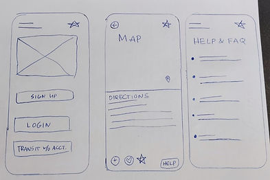
Hand Drawn Wire Frames: Digital Wire Frames:
Four different Hi-Fi prototypes created, the fourth one included using WebAim color contrast to make sure the prototype was accessible for everyone!
Brand development
-
GOALS: provide a SOOTHING AND CALMING experience for users who were already having problems catching routes!
-
Users were having problems with certain button colors or not matching the App branding so I made some adjustments to the colors that were given to me from Google Color Picker! Also made some adjustments to the opacity of the background on certain screens!
-
MOOD BOARD: (later discovered that after changing the opacity of the background images, that certain colors also need to be adjusted even though they were originally picked with Google Color Picker! WANTED TO PROVIDE CALMING SOOTHING COLORS FOR USERS HAVING PROBLEMS USING THE PREVIOUS APP!
-
Sleek logo provided with soothing cursive that transitions into a bus image to make sure users understand that this App provides transit
3 Prototype
Hi-Fi Prototype
To complete this project I used Google Forms, Google Surveys, Figma, Notion, Google Slides, WebAim, and Google Color Picker
Users were having problems with certain button colors or not matching the App branding so I made some adjustments to the colors that were given to me from Google Color Picker! Also made some adjustments to the opacity of the background on certain screens!
Colors were checked with WebAim Color Contrast Checker for People with Visual Impairments! Colors were again adjusted to make a better product that is usable by EVERYONE!
4 Final thoughts
What I learned, and what I’d do differently:
Traveling is a very crucial part of life as it is the best way to make our busy schedule easier on us. Traveling is also actually a good remedy for stress, anxiety and depression. I wanted to take advantage of this within my app by giving the user calming and soothing colors and images!
Also learned Google Color Picker didn’t perfectly match the branding of the App to provide relaxing/soothing colors because I picked colors before adjusting the opacity of the background images!
A few things I’d do differently are:
-
Make some of the buttons more polished (like on the Onboardinog Main Screen)
-
Add Social Media login (so the user can just login to a Social Media account instead of creating an account with Transique) that would make their experience even more easy & simple
.jpg)